
Monochromatic makeup is the soft, tonal, single-shade-everywhere look that has quietly become the defining beauty story of 2026. Editors call it effor
Monochromatic makeup is the soft, tonal, single-shade-everywhere look that has quietly become the defining beauty story of 2026. Editors call it effortless editorial; readers call it the only makeup look that consistently photographs well in unflattering light. The idea is simple: pick one colour story and let it carry the eyes, the cheeks, and the lips. The execution is where the difference between polished and muddy lies. This guide covers what monochromatic makeup actually is, which colour stories suit which undertones, how to keep one shade across three placements from reading flat, and the questions readers are searching for most.
Reviewed by the BeautynFacts editorial team. Last updated: June 2026.
What Monochromatic Makeup Actually Is
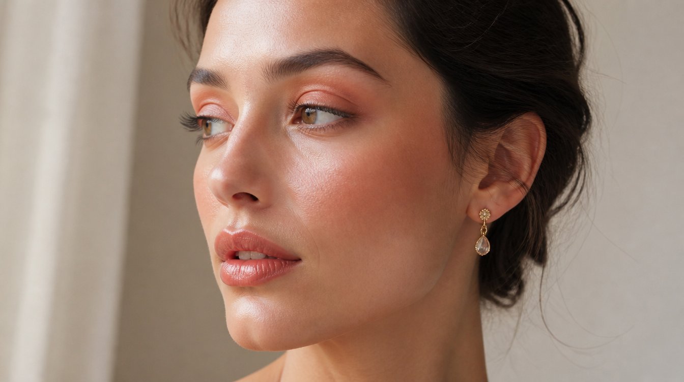
Monochromatic makeup is the practice of using one colour across the eyes, cheeks, and lips, varying the intensity and finish but keeping the hue consistent. The look traces back to 1990s fashion editorials, surfaced again in the early 2010s, and is now in its third major wave, pulled forward by Vogue, Byrdie, and Allure as the antidote to the heavily contoured glam of the past few years. Where contour-and-strobe makeup adds dimension through opposing tones, monochromatic adds dimension through finish: matte at the lash line, satin on the cheek, and sheen on the lip.
The reason it has caught on this cycle is practical. Pulling one colour through your whole face is faster than coordinating three palettes, photographs as cohesive without filtering, and removes the question of whether your blush clashes with your lips. It also reads as intentional even when applied quickly, which is a rare combination in beauty.
Why 2026 Is the Year It Mainstreamed
Three forces converged. Soft-focus tonal minimalism dominated the spring 2026 runways, particularly at brands leaning into the no-makeup makeup space. Beauty publications spent the first half of the year reframing the look from niche editorial to wearable everyday, with Vogue running a feature on tonal beauty in March and Byrdie publishing a how-to guide in April. And formula innovation finally caught up, with brands releasing multi-use sticks and cream pots specifically designed to be swiped across all three placements without the chalky look that used to undermine the look in older blush-as-lipstick attempts.
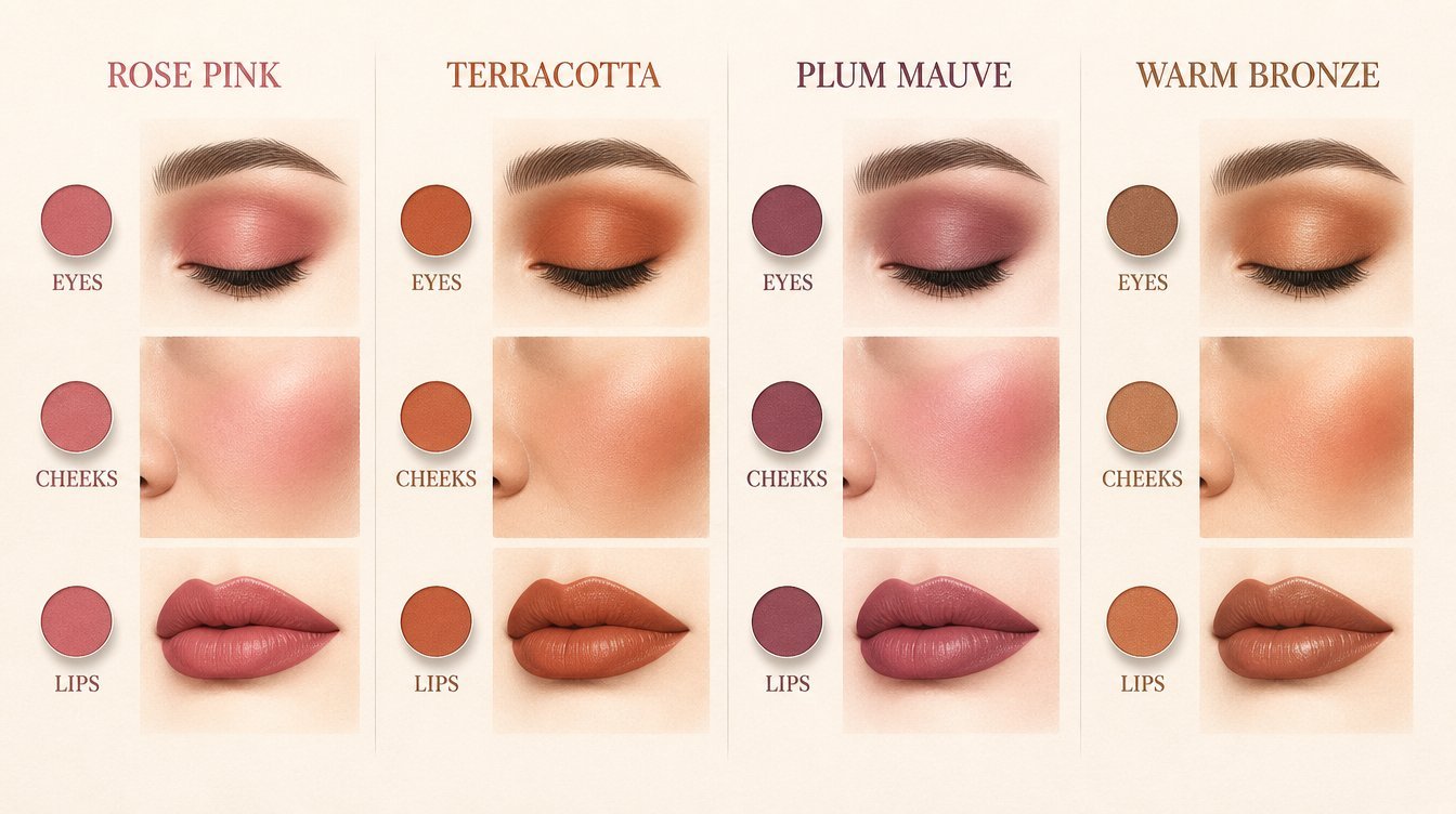
The Four Color Stories That Work on Almost Everyone
Beauty editors have settled on four core monochromatic stories that flatter across the widest range of skin tones. Each carries a distinct mood, so the right pick depends as much on personal style as it does on technical undertone analysis.
Rose Pink
The softest of the four. Reads romantic, slightly youthful, and forgiving on cool and neutral undertones. Works particularly well in spring and early summer light. The trap with rose pink is that on warm undertones it can pull washed out; if your skin reads warm, swap the rose for a dustier mauve to keep the cohesion without losing dimension.
Terracotta
The most universally flattering pick. The orange-red base lights up warm undertones, holds its own on neutral skin, and warms up cool skin when the depth is dialled up slightly. Terracotta photographs especially well outdoors and in golden-hour light, which is part of why it dominates 2026 editorial. If you only buy one monochromatic story, this is the one.
Plum Mauve
The most daring mood-wise, plum mauve is the least challenging to wear technically, thanks to its cool blue base that’s flattering to almost every skin tone. It looks sophisticated and evening-leaning and works well with sharper eye looks. Plum mauve is the one to break out for events; the depth holds up under harsh indoor lighting, where pinks can flatten.
Warm Bronze
The most universally flattering on medium- to deep-skin tones. The metallic finish on the eye, sheer wash on the cheek, and tinted balm on the lip give a glow that no other story matches. On very fair skin, bronze can read as too warm if applied heavily, so go sheer across all three placements.
How to Pick the Color Story for Your Undertone
The shortcut: check the underside of your wrist in natural daylight. Green veins mean a warm undertone; reach for terracotta or warm bronze. Blue or purple veins mean a cool undertone; go rose-pink or plum-mauve. ‘Mixed’ or ‘unclear’ means ‘neutral undertone’, which is the easiest position because all four stories work; pick by mood instead. If you are still unsure, terracotta is the safest default because the warm-neutral base flatters more skin tones than any other shade family.
Building the Look Without It Going Flat
The single biggest mistake people make with monochromatic makeup is applying the same intensity at the same finish in all three placements. The look needs to read as intentional, not as if you ran out of products. The professional principle: vary the finish, not the hue.
Step 1: Skin Prep
Monochromatic makeup lives or dies by the base. Dewy, hydrated skin reflects the colour and keeps it from going chalky. Start with moisturiser, then a thin layer of foundation or skin tint, and skip heavy powder. If you usually set with powder, set only the T-zone and leave the high points of the cheeks dewy because the cream blush needs to grab onto something supple.
Step 2: Cheeks First
This is a counterintuitive rule, but it is what professional makeup artists do. Cream blush goes on first because it is the easiest placement to gauge intensity. Once you know how much pigment is on your cheeks, you can match or vary the eyes and lips around that anchor.
Step 3: Eyes With a Matte Wash
Take the same shade as the blush and apply it to the eyelids in a soft matt wash. A finger or a flat brush works for diffusion. Build to depth only at the outer corner and lash line. Leave the inner lid lighter so the eye still opens.
Step 4: Lips With Sheen
Apply a tinted balm or sheer lip oil in the same family. The shift in finish, from matte at the eye to sheen at the lip, is what creates the editorial dimension without breaking the monochromatic illusion. Avoid a fully glossy lip if your eye is also matt; the contrast reads sloppy rather than considered.
Step 5: Optional Highlight
A whisper of a slightly lighter shade in the same family at the inner corner of the eye and the high points of the cheekbones lifts the whole look. Skip white highlighter; it breaks the monochromatic story. Use champagne or peach instead if your story is warm and pearl or pink if your story is cool.
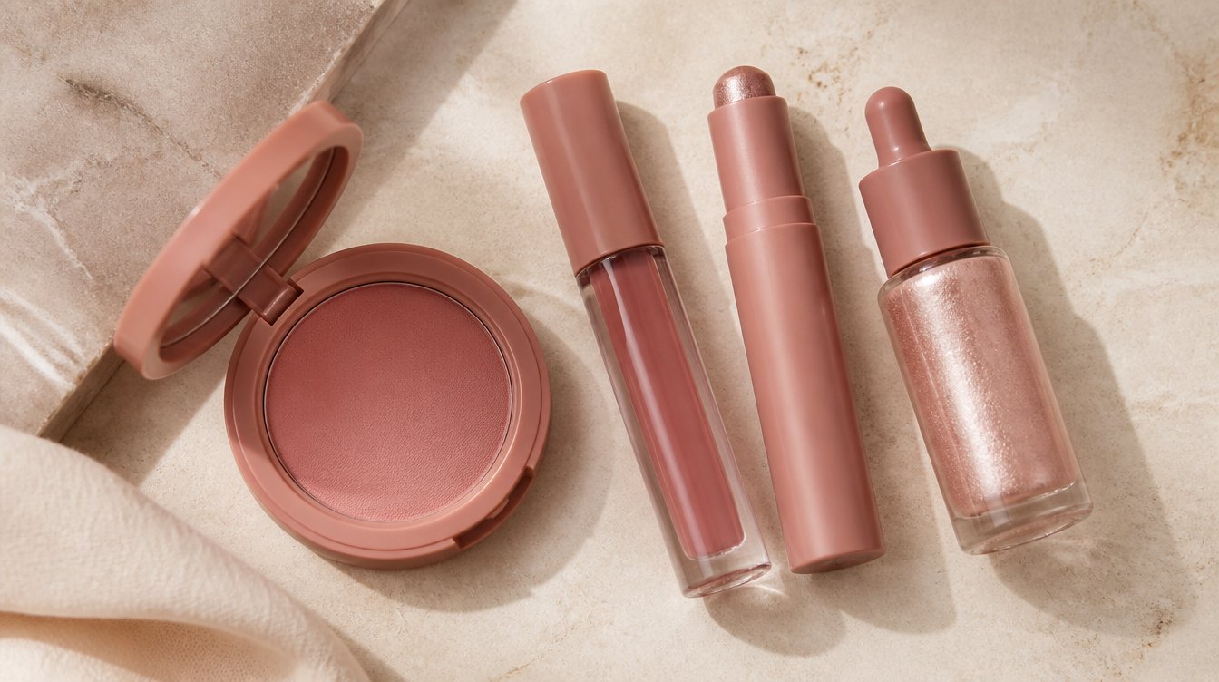
The Tools That Make Monochromatic Easy
You do not need a new kit. Three tools cover the entire look: a cream blush stick or pot, a single eyeshadow in a coordinating shade, and a tinted lip balm or lip oil. Multi-use sticks marketed specifically for cheeks, eyes, and lips are convenient but not required; a regular cream blush works on the eye if the base is well prepped. The brushes that matter are a fluffy diffusing brush for the eye and a small, dense buffing brush for the cheek.
Monochromatic for Different Eye Shapes
The look adapts naturally to every eye shape because there is no rigid liner or graphic placement to navigate. On hooded eyes, apply the matte wash slightly above the natural crease so it stays visible when the eye is open. On monolid eyes, focus the depth at the lash line and let it fade upward; the gradient is what gives the eye dimension. On round eyes, extend the shade slightly past the outer corner to elongate. On almond eyes, keep the placement classic; the shape is already doing the work.
The Outfit and Hair That Finish the Look
Monochromatic makeup pairs best with simple, tonal outfits in adjacent or neutral shades. The look fights heavily printed clothing because the eye does not know where to land. Hair that frames the face softly works better than slicked-back hair, which can compete with the soft-focus makeup. The combination that consistently photographs well: cream or beige clothing, soft natural hair, and terracotta or rose monochromatic faces.
Common Mistakes Editors Flag
Beyond the intensity-and-finish issue, three mistakes show up repeatedly. The first is matching the lip shade exactly to a coloured top or accessory; the eye should bounce between makeup and outfit, not lock them together. The second is choosing a story that is too far from your natural lip colour, which makes the look feel like a costume; stay within two shades of your natural depth. The third is using powder blush instead of cream; powder breaks the tonal continuity because it sits differently on the skin than the cream or balm finishes at the eye and lip.
What Makes Monochromatic Read Editorial vs. Costume
The difference is restraint. Editorial monochromaticism stops at three placements and one shift in finish. A monochromatic costume happens when the wearer adds a fourth element in the same shade, like coloured eyeliner or a matching nail, which tips the look from polished to themed. The rule editors follow: Pick three placements (eyes, cheeks, and lips) and let everything else stay neutral. Nails, hair, and jewellery all stay quiet.
Monochromatic Through the Day
The look survives a full day better than most because the lack of contrast hides settling and wear. Touch-ups are simpler too: just refresh the lip and dot a little of the lip product on the cheek and eye to revive. Keep the original cream product in your bag rather than a separate touch-up kit. If the eye fades faster than the cheek, add a fingertip of the cream over the lid; it sets within seconds and rebuilds the depth without disturbing the cheek.
What 2026 Has Added to the Look
Two shifts. First, the rise of slightly metallic or pearl finishes on the lid gives the wash extra reflectivity without changing the colour story. Second, a soft tonal contour using a shade slightly deeper than the blush in the same family, applied at the temples and along the jaw. This adds dimension without breaking the monochromatic rule. Both moves push the look from minimal to refined.
Frequently Asked Questions About Monochromatic Makeup
What is monochromatic makeup, and how is it different from no-makeup makeup?
Monochromatic makeup uses one colour story across the eyes, cheeks, and lips, varying intensity and finish but keeping the hue consistent. No-makeup makeup, by contrast, aims for the illusion of bare skin with the smallest amount of product possible. Monochromatic is intentionally polished and tonal; no-makeup makeup is intentionally invisible. The two are sometimes confused because both rely on soft finishes and minimal contouring, but monochromatic shows up in photographs, and no-makeup makeup is designed to disappear.
How do I pick the right monochromatic shade for my skin tone?
The fastest method is the wrist test. Look at the veins on the underside of your wrist in natural daylight. Green veins indicate warm undertones, so terracotta and warm bronze work best. Blue or purple veins indicate cool undertones, whereas rose, pink and plum mauve flatter. Mixed or unclear veins mean a neutral undertone, which is the easiest position because all four core stories work. If you are still unsure, terracotta is the universal safe pick because its warm-neutral base flatters more skin tones than any other shade family.
Can I use the same product on eyes, cheeks, and lips?
Yes, with one caveat. A cream blush or multi-use stick can go on all three placements, which is part of why monochromatic makeup is so fast. The caveat is finish: the eye needs a matte or satin finish to anchor the look, the cheek needs a soft sheen, and the lip needs the most gloss. If your one product is too matt, top the lip with clear balm. If it is too glossy, press it into the eye with a fingertip rather than swiping to mute the shine. Multi-use products designed for all three placements handle the balance automatically.
Does monochromatic makeup work for everyday wear or just photoshoots?
Everyday wear is where the look performs best. Because the colour story is unified, the makeup reads polished without much technique, which makes it ideal for mornings when you have five minutes. The fast application and natural depth are exactly why beauty publications have spent 2026 reframing it as a daily look rather than a photoshoot trick. Pair a soft terracotta or rose story with a neutral outfit and you have a complete look that photographs as well at 10 a.m. on a phone as it does at 10 p.m. under flash.
How do I keep monochromatic makeup from looking flat or muddy?
Three rules cover it. First, vary the finish across the three placements: matte at the eye, satin at the cheek, and sheen at the lip. Same colour, different texture. Second, build intensity gradually rather than going heavy in one spot; if the eye is the deepest point, the cheek should be medium and the lip the softest. Third, prep the skin so it stays dewy, because dry skin makes cream products grab and look chalky. If the look reads flat, add a single touch of a slightly lighter shade in the same family at the inner eye corner and the high cheekbones; that one move usually fixes it.
Which monochromatic colour is most flattering on dark skin tones?
Warm bronze and deep terracotta are the strongest picks on medium to deep skin tones. Both have enough warmth to light up the skin without flattening it, and the depth holds up against richer skin without disappearing. Plum mauve also works particularly well on deep skin because the cool blue base creates a striking contrast that photographs beautifully. The shade to be cautious with is light rose pink, which can read ashy on deeper skin; if you love rose, look for a deeper berry-rose or dusty rose in the same family rather than a soft baby pink.
RELATED ARTICLES:
- Dolphin Skin Makeup: The Dewy 2026 Finish That Actually Lasts
- 2026 Makeup Trends: The Biggest Looks Everyone Will Wear
- Skin Tints That Work For a Natural Base
COMMENTS